WordPress Editor
The WordPress block editor (sometimes called Gutenberg) is how all content is written and formatted on the Grow Social Capital website. Rather than one big text box, everything is made up of individual blocks — each block is a separate element like a heading, a paragraph, an image, or a button.
This guide covers the blocks you will use most often and how to use them correctly.
How to add a block
Section titled “How to add a block”Wherever you see content on a post or page, you can click the + button (the Block Inserter) to add a new block. You can also type / followed by the block name — for example /heading or /image — and press Enter to insert it directly.
Heading block
Section titled “Heading block”Headings give your content structure. They help readers scan a page and understand how sections relate to each other. They also help search engines understand what a page is about.
Heading levels and what they mean
Section titled “Heading levels and what they mean”WordPress headings run from H1 to H6. Think of them like an outline:
| Level | Use for |
|---|---|
| H1 | The page or post title — added automatically, never add a second H1 |
| H2 | Main sections of the page |
| H3 | Sub-sections within an H2 section |
| H4 | Sub-sections within an H3 section |
| H5, H6 | Rarely needed — only for very deep content structures |
A correct heading structure looks like this:
H1: How to Get Involved with Grow Social Capital ← page title (automatic) H2: Volunteering H3: Regular volunteers H3: Event volunteers H2: Donating H3: One-off donations H3: Monthly givingChoosing a heading level
Section titled “Choosing a heading level”When you add a heading block, you can change the level using the H1–H6 buttons in the block toolbar at the top.
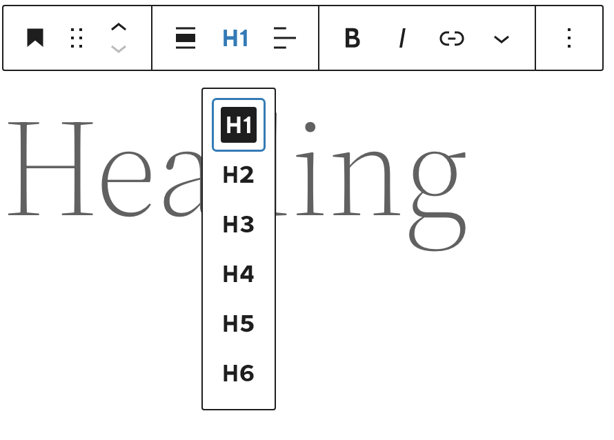
Click the appropriate level for where the heading sits in your content structure.
Changing heading appearance without changing its level
Section titled “Changing heading appearance without changing its level”If you need a heading to look different — larger, smaller, a different weight — use the Typography settings in the right-hand block settings panel. You can adjust font size, line height, letter spacing, and more, without changing the semantic level.
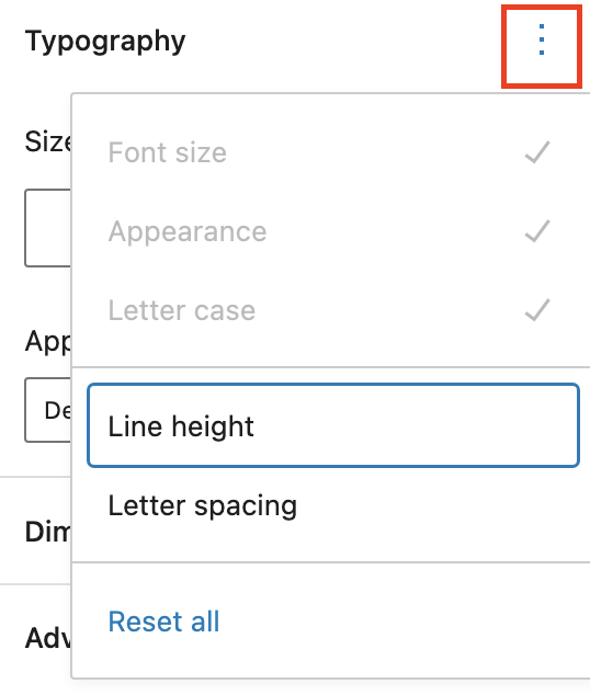
This lets you keep the correct heading structure while still controlling how it looks.
Paragraph block
Section titled “Paragraph block”The Paragraph block is the default block for all body text. When you start typing in a new post, you are already in a paragraph block.
Formatting text
Section titled “Formatting text”The paragraph toolbar gives you common formatting options:
- Bold — use sparingly for genuinely important words or phrases. Do not use bold text in place of a proper heading — if it is the start of a new section, use a Heading block at the correct level instead
- Italic — use for titles, technical terms, or gentle emphasis
- Link — see Adding links below
- More options — strikethrough, subscript, superscript, highlight, inline code
Changing font size
Section titled “Changing font size”If you need body text to appear at a different size, select the paragraph block and look at the Typography section in the right-hand settings panel. You can choose from preset sizes (Small, Medium, Large, X-Large) or set a custom size. This is the correct way to make text larger — not by using a heading block.
Image block
Section titled “Image block”Use the Image block to add photos, graphics, or illustrations to your content.
Adding an image
Section titled “Adding an image”-
Click the + Block Inserter and search for Image, or type
/imageand press Enter. -
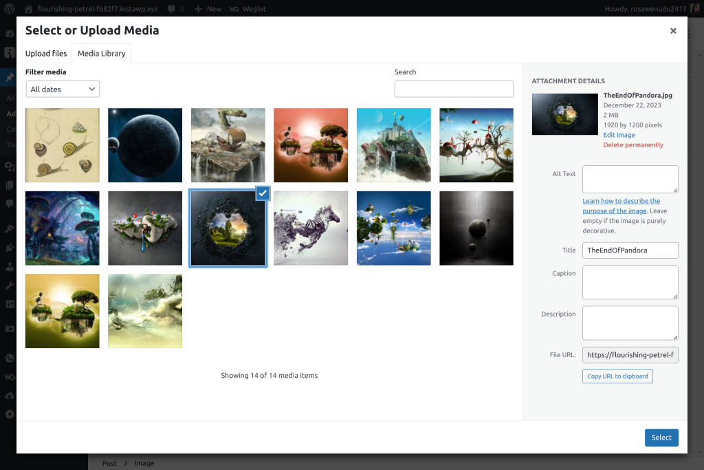
You will see three options:
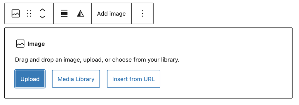
- Upload — upload a new image file from your computer
- Media Library — choose an image already uploaded to the website
- Insert from URL — paste a direct link to an image (use with caution)
-
Select or upload your image.
-
Once inserted, you can resize the image by dragging the handles on its edges, or set exact dimensions in the block settings panel on the right.
Always add alt text
Section titled “Always add alt text”Alt text is a written description of the image used by screen readers and search engines. It is not optional — every image should have meaningful alt text.
In the right-hand settings panel, find the Alt text field and describe what is in the image. For example: Two volunteers sorting food donations at a community event.
Do not leave alt text blank, and do not just repeat the image filename.
Image alignment
Section titled “Image alignment”You can align images left, right, or centre using the alignment options in the toolbar. Wide width and Full width options are also available to break images out beyond the standard content area.
Adding links
Section titled “Adding links”You can add a link to any selected text inside a Paragraph, Heading, or other text block.
-
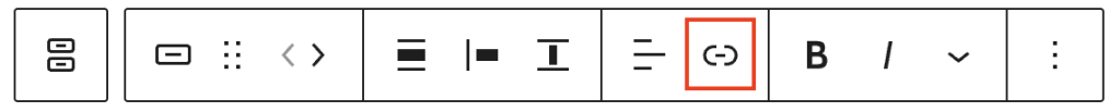
Select the text you want to turn into a link by clicking and dragging over it.
-
Click the Link icon (it looks like a chain link) in the block toolbar.
-
Type or paste the URL into the link field that appears and press Enter.
-
To open the link in a new tab, click the settings icon (gear or arrow) next to the URL field and toggle on Open in new tab. Use this for external links — links to other websites — so readers do not lose their place on your page.
-
To remove a link, click anywhere in the linked text, click the link icon in the toolbar, then click the unlink button.
Buttons block
Section titled “Buttons block”Buttons are used to draw attention to an important action — for example “Register now”, “Read more”, or “Get in touch”.
Important: buttons live inside a Buttons container
Section titled “Important: buttons live inside a Buttons container”This trips people up. In the WordPress block editor, you cannot add a single button on its own. A Button is always nested inside a Buttons block — a container that holds one or more buttons and controls how they are laid out.
Think of it like this: the Buttons block is the tray, and each Button block is a button sitting in that tray. You always start by adding the tray.
Adding a button
Section titled “Adding a button”-
Click the + Block Inserter and search for Buttons, or type
/buttonsand press Enter.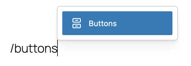
A Buttons block will appear with one default button ready to edit.
-
Click on the button text and type your button label — for example “Register now”.
-
Add a link to the button by clicking the Link icon in the button’s toolbar and entering the destination URL.
-
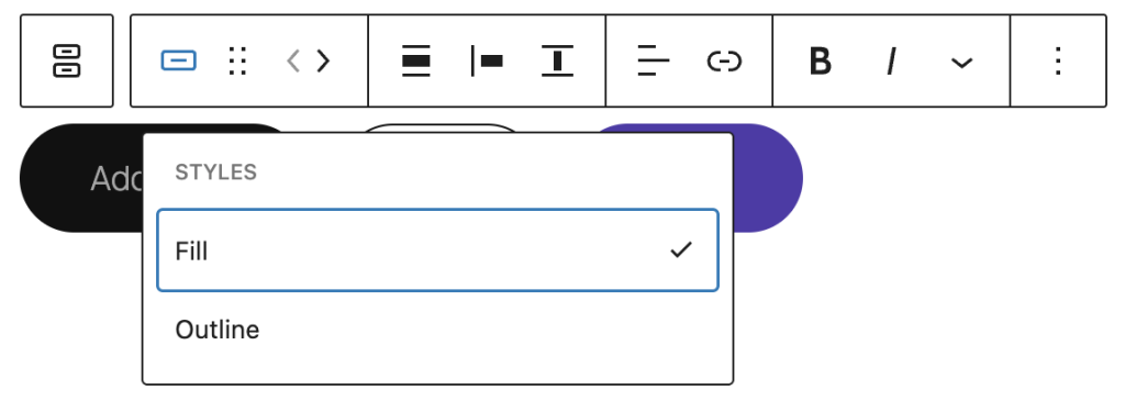
Change the button style using the toolbar. WordPress offers filled (solid background) and outline styles by default. Your theme may offer additional styles.
-
To add a second button to the same row, click the + icon that appears to the right of the existing button within the Buttons block.
Buttons block toolbar
Section titled “Buttons block toolbar”The toolbar for the Buttons container (select it by clicking the outer area) controls how buttons are arranged:
- Justification — align buttons left, centre, right, or space them out
- Orientation — stack buttons vertically or keep them in a row
- Align — make the button group wide or full width
The toolbar for an individual Button (select by clicking directly on the button) controls the link, text formatting, and style of that specific button.
Good habits for the editor
Section titled “Good habits for the editor”- One H1 per page — the page title is always H1. Never add another.
- Use headings in order — do not jump from H2 to H4. Every heading level should follow logically from the one above.
- Paragraphs for text — do not use heading blocks just to make text bigger. Use paragraph font size settings.
- Alt text on every image — always describe what is in the image.
- Buttons need a Buttons container — you cannot add a button block directly; always start with Buttons.
- Preview before publishing — use the Preview button (top right) to see how the page looks to visitors before it goes live.
Page last updated at 20 April 2026 20:46 by Sarah Tamsin